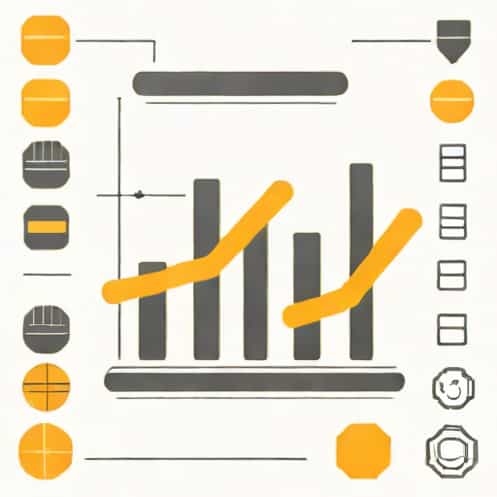
A segmented bar graph is a powerful visual tool used to display data that is divided into categories or segments within a whole. Unlike a standard bar graph, where each bar represents a single value, a segmented bar graph allows each bar to be divided into multiple parts, showing the proportion of different components. This type of graph is especially useful for comparing subcategories across different groups and for visualizing percentages, distributions, or cumulative data. Understanding how to make a segmented bar graph is essential for students, professionals, and anyone looking to present complex data in a clear and effective way.
Understanding Segmented Bar Graphs
Segmented bar graphs, also known as stacked bar graphs, consist of rectangular bars divided into segments, each representing a part of the total. The length of the entire bar corresponds to the total value, while each segment’s length represents the proportion of a category within that total. These graphs can be oriented vertically or horizontally and are widely used in business reports, educational presentations, and research to compare multiple groups simultaneously.
Advantages of Segmented Bar Graphs
- Clearly shows the composition of each category
- Makes it easier to compare subcategories across different groups
- Visually represents proportions or percentages
- Provides insight into trends, patterns, and relationships in data
- Can handle multiple variables in a single visual representation
Step 1 Collect and Organize Data
The first step in creating a segmented bar graph is to collect accurate data and organize it in a meaningful way. Identify the categories you want to compare and the subcategories that will make up the segments of each bar. Data can come from surveys, experiments, or statistical reports. It is important to ensure that the data is complete, consistent, and relevant to the objective of your graph.
Organizing Data in a Table
Once you have collected the data, organize it into a table. Each row can represent a main category, while each column can represent subcategories or segments. For example, if you are showing the sales distribution of different products across several regions, each row would be a region and each column would be a product. Adding a total column helps in calculating percentages or proportions for each segment.
Step 2 Choose the Graphing Tool
After organizing the data, select a tool to create the segmented bar graph. There are several options available
Software Options
- Microsoft Excel or Google Sheets – widely used for creating bar graphs with built-in stacking options
- Tableau or Power BI – useful for more advanced data visualization
- Python or R – ideal for programmatic and customizable graphs using libraries like Matplotlib, Seaborn, or ggplot2
- Manual drawing – for classroom or illustrative purposes using graph paper and markers
Step 3 Set Up the Axes
In a segmented bar graph, one axis represents the main categories, while the other represents the value or total. For vertical graphs, the horizontal axis (x-axis) usually shows the categories, and the vertical axis (y-axis) shows the value scale. For horizontal graphs, the axes are reversed. Label each axis clearly, including units if applicable, and set a consistent scale to accurately represent proportions.
Example
If you are comparing the monthly sales of different products, the x-axis would list the months (January, February, March, etc.), and the y-axis would show the total sales in units or revenue. Each bar will be divided into segments representing different products, stacked to show the total sales for the month.
Step 4 Calculate Segment Sizes
To accurately create a segmented bar graph, calculate the size of each segment. If your graph represents absolute numbers, each segment’s height or length should match the value it represents. If your graph represents percentages, calculate the percentage of each subcategory within the total category. This ensures that the segments add up to the total for each bar.
Example Calculation
Assume a category has three subcategories with values 20, 30, and 50. The total is 100. The segments should represent 20%, 30%, and 50% of the bar length. Using this proportional approach ensures the graph is accurate and visually meaningful.
Step 5 Draw or Plot the Bars
Once the segment sizes are determined, start drawing or plotting the bars. Begin with the first category, drawing the first segment at the bottom (or left for horizontal bars), then add the next segment on top (or to the right). Repeat this process until all segments are added. Ensure that segments are clearly distinguishable, either by using different colors, patterns, or shading.
Tips for Segment Design
- Use contrasting colors for each segment to make them easily identifiable
- Include a legend to explain what each color or pattern represents
- Maintain uniform bar width and spacing for visual consistency
- Label segments with values or percentages if space allows
Step 6 Add Titles, Labels, and Legends
A well-labeled segmented bar graph is easier to understand and interpret. Include a descriptive title that summarizes the purpose of the graph. Label each axis clearly and provide a legend to identify each segment. If necessary, add annotations or data labels to highlight key information or trends.
Example Labeling
For a sales graph, the title could be Monthly Sales Distribution by Product. The x-axis label might be Month, and the y-axis label Total Sales (Units). The legend should indicate which color corresponds to each product. Adding data labels on each segment can provide additional clarity, showing the exact number or percentage each segment represents.
Step 7 Review and Adjust
After completing the segmented bar graph, review it for accuracy and visual appeal. Check that all segments are correctly proportioned, colors are consistent, and labels are clear. Adjust any elements that may cause confusion, such as overlapping labels or unclear color choices. Ensure the graph communicates the intended message effectively and that viewers can easily interpret the data.
Best Practices
- Keep the design simple and avoid excessive colors or patterns
- Ensure segments are proportionally accurate
- Use readable fonts for labels and titles
- Provide a clear legend to prevent misinterpretation
- Double-check calculations and data representation
Creating a segmented bar graph involves several steps, including organizing data, choosing a tool, setting up axes, calculating segment sizes, plotting the bars, and adding labels and legends. By following these steps carefully, you can produce a graph that effectively communicates complex data, highlights subcategory distributions, and facilitates comparisons across groups. Segmented bar graphs are versatile tools for business, education, and research, allowing viewers to quickly understand relationships and trends in multi-dimensional data. With proper planning, attention to detail, and clear design, anyone can make an informative and visually appealing segmented bar graph.